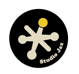
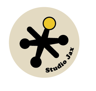

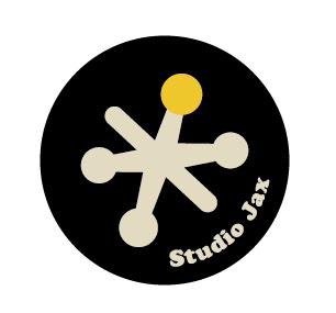
✨ Studio Jax - Personal Logo
This logo is a visual homage to both childhood play and timeless design. Inspired by the classic game of Jacks—a favorite from my childhood—the mark not only evokes nostalgia but also cleverly plays on my nickname “Jax,” short for Jaxanna. It's a fitting symbol for a design philosophy rooted in curiosity, possibility, and a playful outlook.
The star-like jack is topped with a yellow dot, symbolizing a “thinking head.” This represents creativity, insight, and energy—qualities I infuse into every project.
Typography
I chose Cooper Black, a font that straddles the line between retro and modern, bold yet friendly. It's a nod to my love for vintage aesthetics and timeless design.
Color Palette
⚫ Black reflects sophistication, mystery, and a little rebellion—just like me.
🟡 Mustard Yellow captures joy, enlightenment, and optimism, echoing the bright ideas behind my creative work.
⚪ Cream symbolizes new beginnings and offers a soft, retro contrast.
This logo isn’t just a design—it’s a story. A snapshot of who I am as a person and as a designer.
🟡 Mustard Yellow captures joy, enlightenment, and optimism, echoing the bright ideas behind my creative work.
⚪ Cream symbolizes new beginnings and offers a soft, retro contrast.
This logo isn’t just a design—it’s a story. A snapshot of who I am as a person and as a designer.
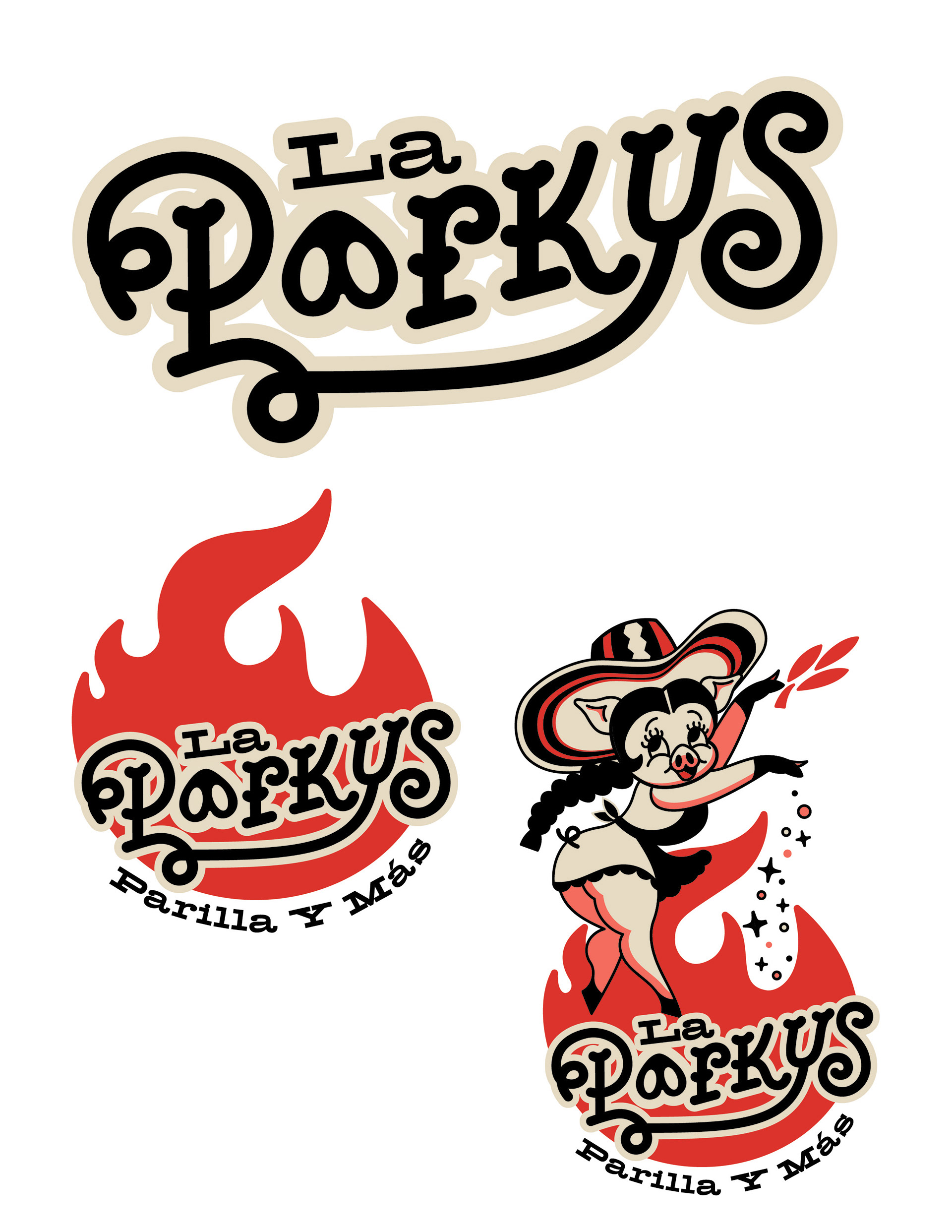
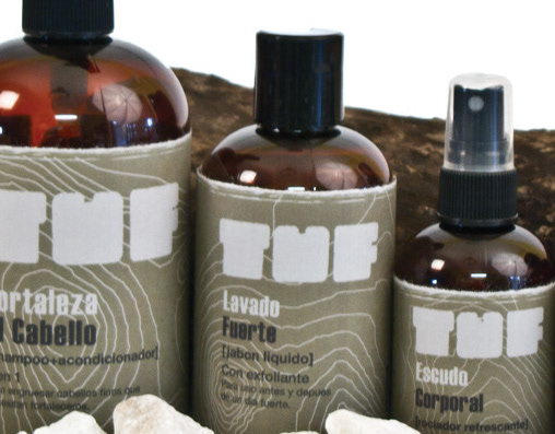
🐖 La Porkys – Grill Logo
The La Porkys logo was created for my brother's local grill venture focused on smoked pork, inspired by a deeply personal connection. The business name is a playful nod to our mom—affectionately nicknamed “La Porkys” (The Little Pig)—a joyful, dancing spirit who loves her Colombian roots. This concept was the foundation for both the branding and the character design.
The final identity includes
- A custom word-mark, where each letter subtly evokes porcine features (like a pig’s snout and curled tail), giving it both charm and cohesion.
- A flame badge version for flexible use on packaging, stickers, or signage, highlighting the grill/smokehouse concept.
- A dancing pig character wearing a sombrero volteado, a traditional Colombian hat. The character adds storytelling and cultural depth to the brand while celebrating our mother’s vibrant personality.
While playful and full of character, the logo was designed with scalability in mind. Simpler variations ensure versatility across applications—from posters to business cards to social media icons.
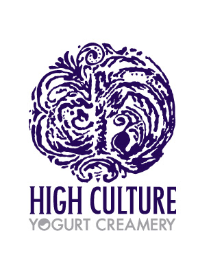
🐄 High Culture - Yogurt Creamy Concept Logo
This is a concept logo for High Culture, a lifestyle-focused dairy brand that specializes in artisanal yogurt and cultured dairy products. The logo is designed to evoke a sense of refinement, heritage, and indulgence, appealing to a clientele that values luxury and authenticity in their food choices.
The emblem draws inspiration from the rich history of yogurt-making, featuring swirling forms that represent the movement and texture of live cultures. Within the intricate design, the initials "H" and "C" are subtly embedded, reflecting the brand name High Culture while also symbolizing the microbial cultures essential to yogurt production.
The logo combines elegance with organic motion, conveying the idea that cultured food can be both elevated and elemental. The pairing of deep indigo and soft gray communicates premium quality and calm sophistication, setting the tone for a brand that takes its culture seriously, both literally and figuratively.
🌱 PUPA – Eco-Friendly Coffin Concept Brand Identity
This concept logo for PUPA is a visual metaphor for life’s final metamorphosis. Each letterform hints at the elongated shape of a cocoon or coffin, while the color-tipped terminals resemble sprouting leaves, reflecting the idea of returning to the earth. The name “PUPA” refers to the transformative stage between larva and adult in insects, mirroring the spiritual and physical shift from life to afterlife.

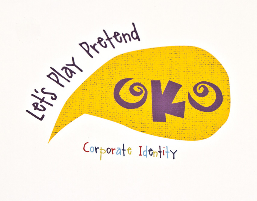
🐥 OKO – Children's Clothing Concept Brand Identity
This concept logo, OKO, is for a whimsical clothing line designed for toddlers who love to play pretend. Each garment is inspired by animals, encouraging kids to step into character and spark their imaginations through dress-up.
The logo captures this playful spirit with an abstract illustration of a chick’s head—bold, bright, and full of personality. The stylized word-mark “OKO” features spiral elements that mimic wide, curious eyes, reinforcing the theme of imagination and wonder. The vibrant yellow speech bubble evokes energy and cheer, while the tagline "Let’s Play Pretend" arcs overhead like a giggle mid-air.
Altogether, the logo visually speaks to OKO’s mission: to dress little dreamers in clothes that help them become lions, bunnies, chicks—or anything they want to be.
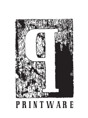
🖨️ Printware – Designer Plates Concept Logo
The concept logo for "Printware" represents a line of ceramic plates that celebrates the blend of graphic art and functional design. Each piece honors the rich legacy of printmaking and graphic design, highlighting the craftsmanship and tactile beauty of traditional printing techniques.
Inspired by woodblock printing—one of the earliest methods of graphic reproduction—the logo features a bold, stylized "P" carved into a textured rectangle. This design mimics the raw, uneven impressions characteristic of hand-inked woodcuts. It not only references the history of printing but also emphasizes the artisanal quality of the product.
With its rugged textures and timeless serif lettering, the logo conveys a brand that values craftsmanship, permanence, and the printed form, whether on paper or porcelain.

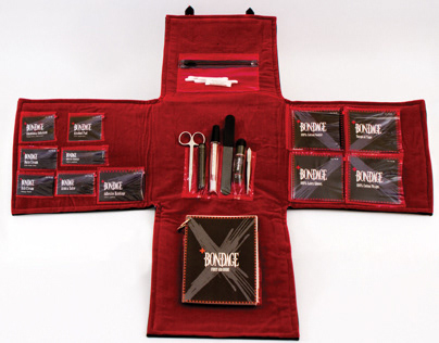
⛓️ Bondage - First Aid Kit Concept Logo
This concept logo was created for a specialized first aid kit tailored for the BDSM community, designed with both care and kink in mind. The custom typography takes visual cues from the fashion and hardware commonly associated with bondage culture, such as leather straps, collars, buckles, and restraint points.
Sharp angles and ornamental elements hint at the aesthetics of fetish wear, while the circular cutouts nod to rivets or O-rings—functional yet decorative. The wordmark maintains a sense of sophistication and restraint (pun intended), balancing edgy subject matter with thoughtful design.
The result is a visual identity that confidently embraces the sensual, the subversive, and the safe—paying homage to a culture that values both play and aftercare.