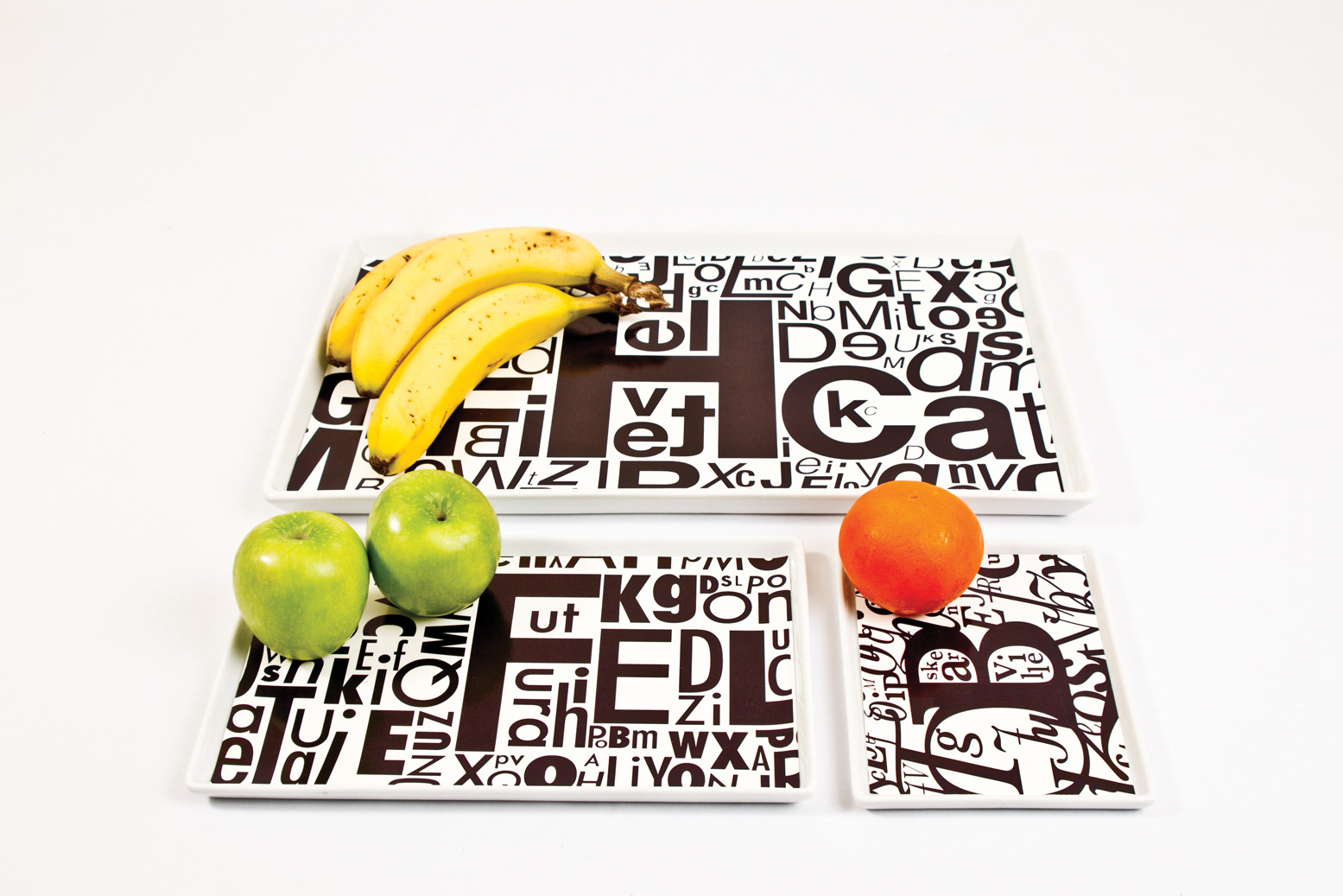

Printware is a conceptual product line that merges the worlds of typography and tableware. Designed for lovers of design, print, and type, this ceramic plate collection transforms everyday objects into bold statements of visual culture. The line also includes a supporting logo, packaging design, and brand concept system.
Each piece is inspired by the visual language of traditional printing techniques, particularly letterpress and woodblock type. Densely layered compositions of letters and glyphs wrap the ceramic surfaces, turning each plate into a composition of expressive form and functional design. The plates serve not only as vessels for food but also as canvases for typographic storytelling.
🔤 Brand Identity & Logo
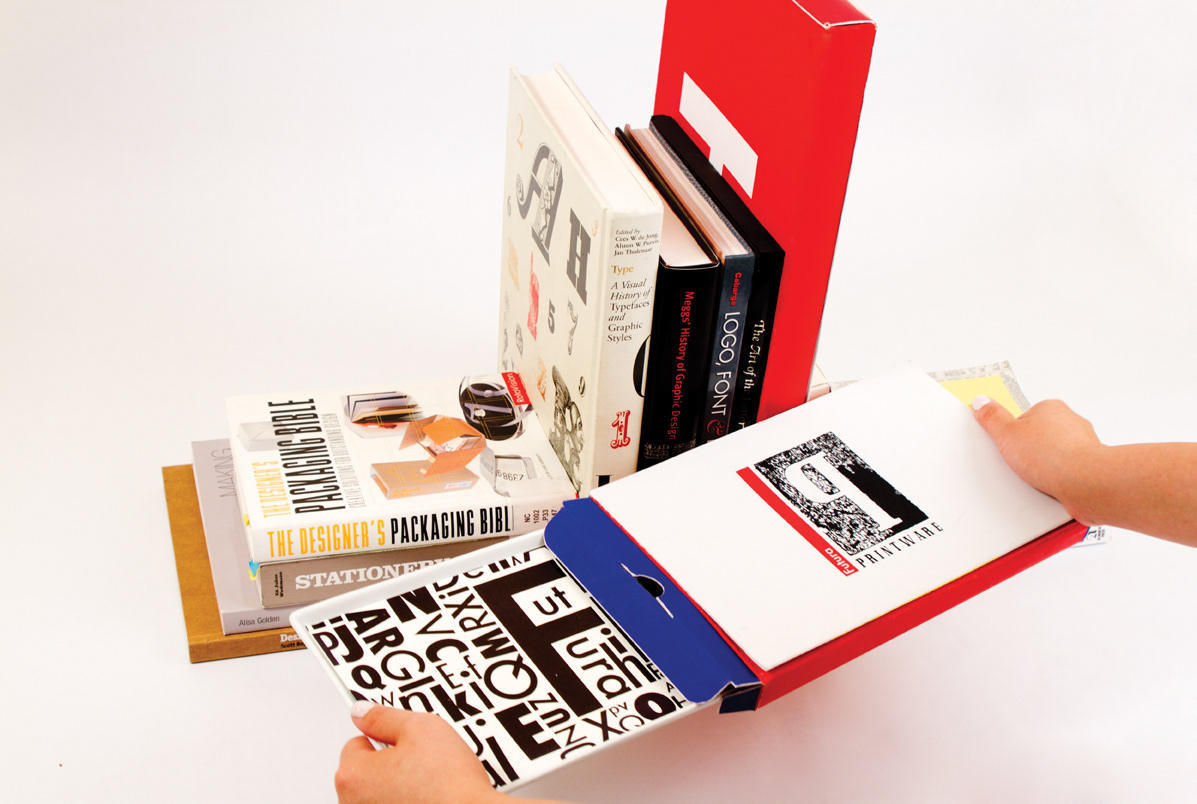
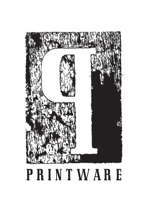
The Printware logo features a bold, stylized “P” embedded in a rough-textured, woodcut-like block. This nod to historic typesetting methods reinforces the brand’s roots in print history while lending it a tactile, crafted sensibility. The classic serif type and distressed block texture communicate authenticity, permanence, and artistic tradition.
📦 Packaging Concept
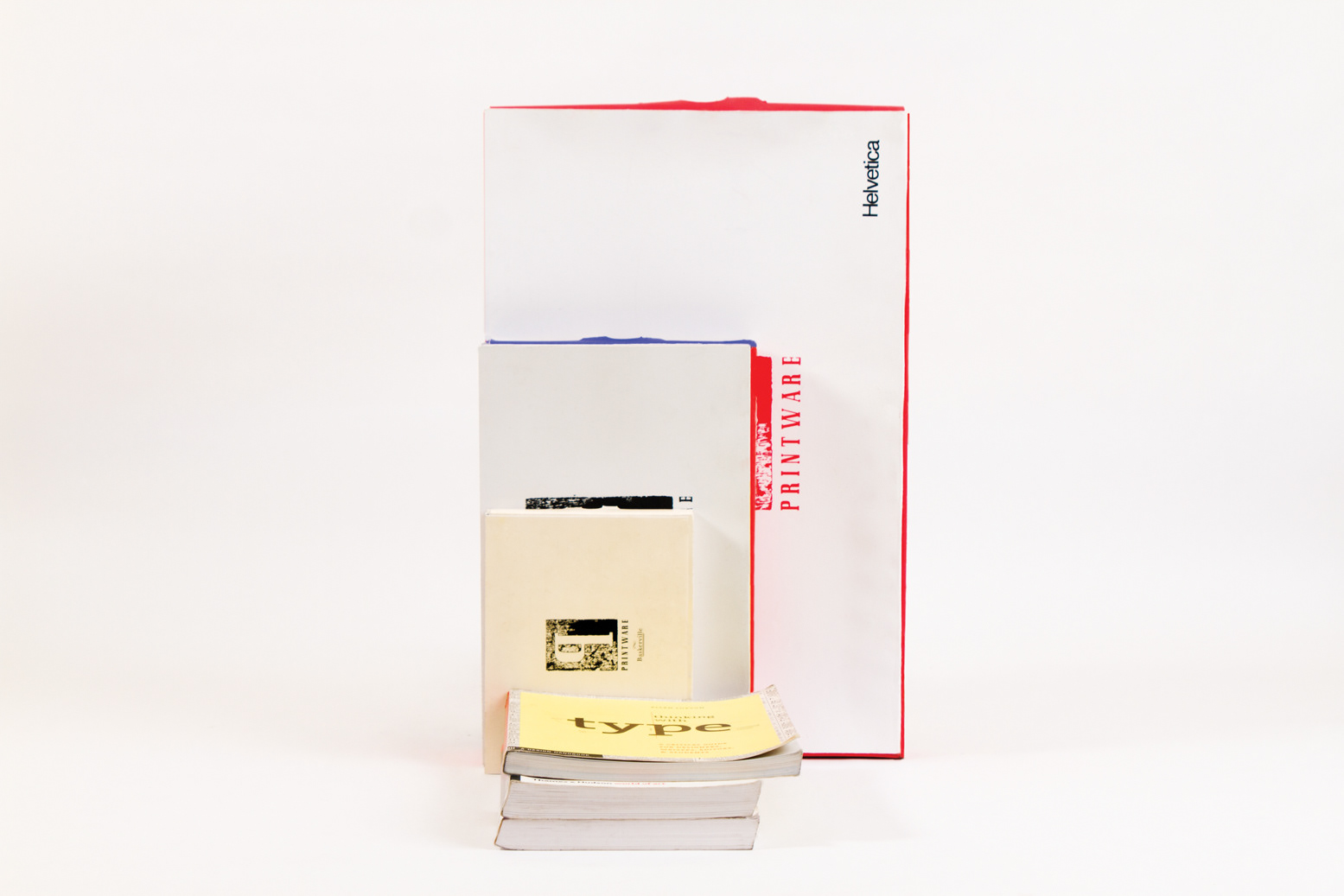
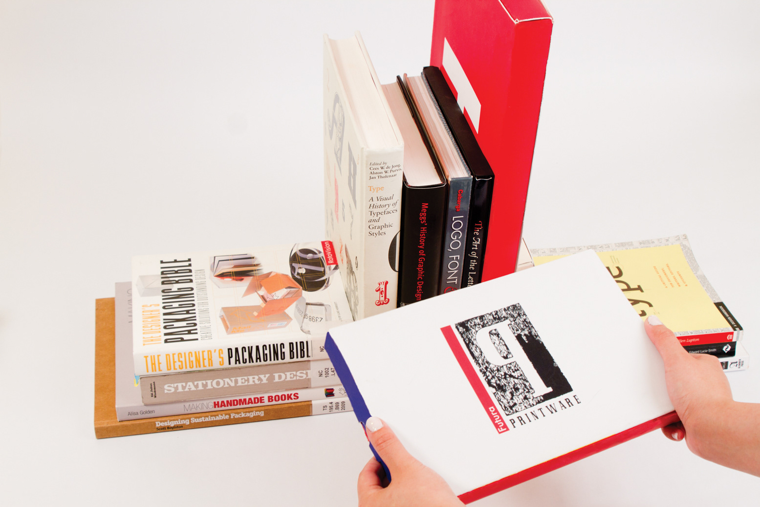
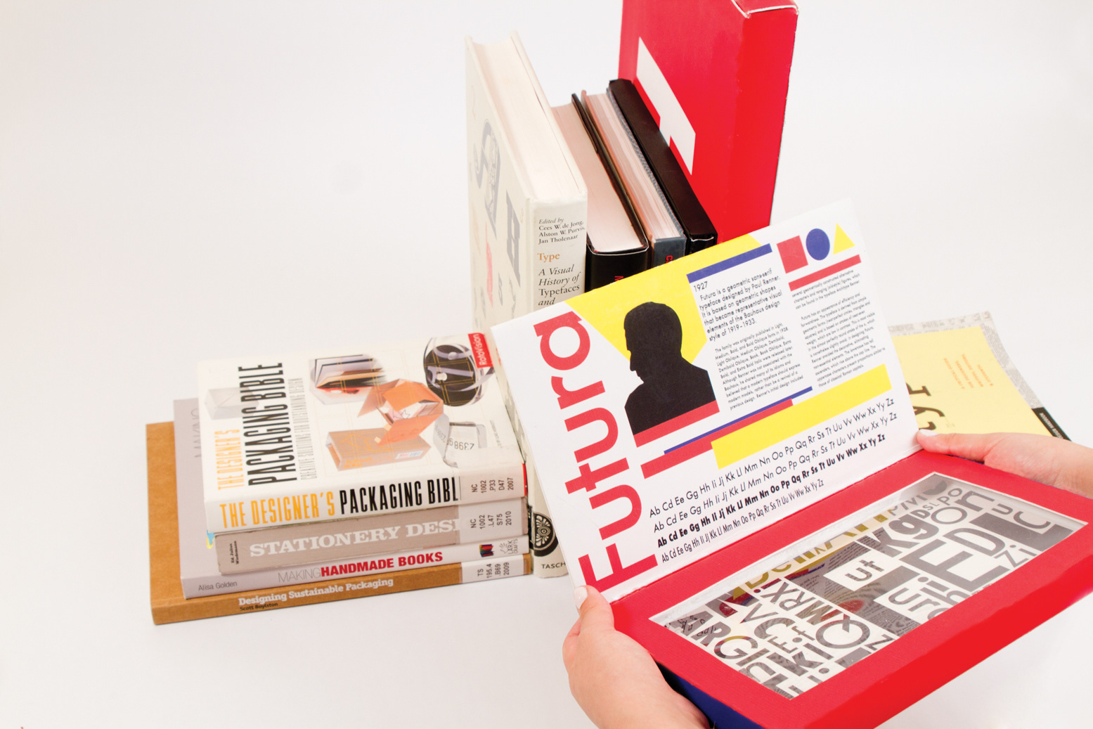
The packaging references classic type specimen books, designed in the form of nested, book-like sleeves—each layer unveiling content about a specific typeface. The box becomes both protection and pedagogy, drawing visual cues from editorial design, Swiss modernism, and post-war European typography.
🍽️ Audience & Use
Printware is designed for graphic designers, book lovers, typophiles, and collectors, as well as design-conscious consumers who seek more than minimalism in their everyday objects. The plates are just as suited for dinner parties as they are for display shelves.